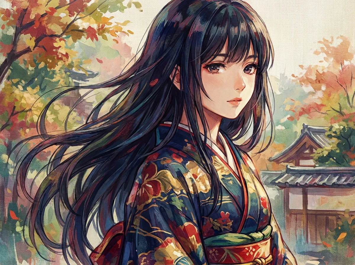
Make minimalist anime characters with AI
Single-line contours, two-color flat fills, and big negative space. Use Anifusion to turn quick prompts into mascots, posters, UI characters, and modern editorial illustration.
Franchise, studio, and character references describe style or mood only, not a license, sponsorship, endorsement, or affiliation. You are responsible for your prompts and outputs. As-is, no warranty of non-infringement (not legal advice). For DMCA, copyright, or trademark issues, use our Contact page.
Generate a Minimalist anime scene
Type a scene below and press Generate.
About Minimalist anime style
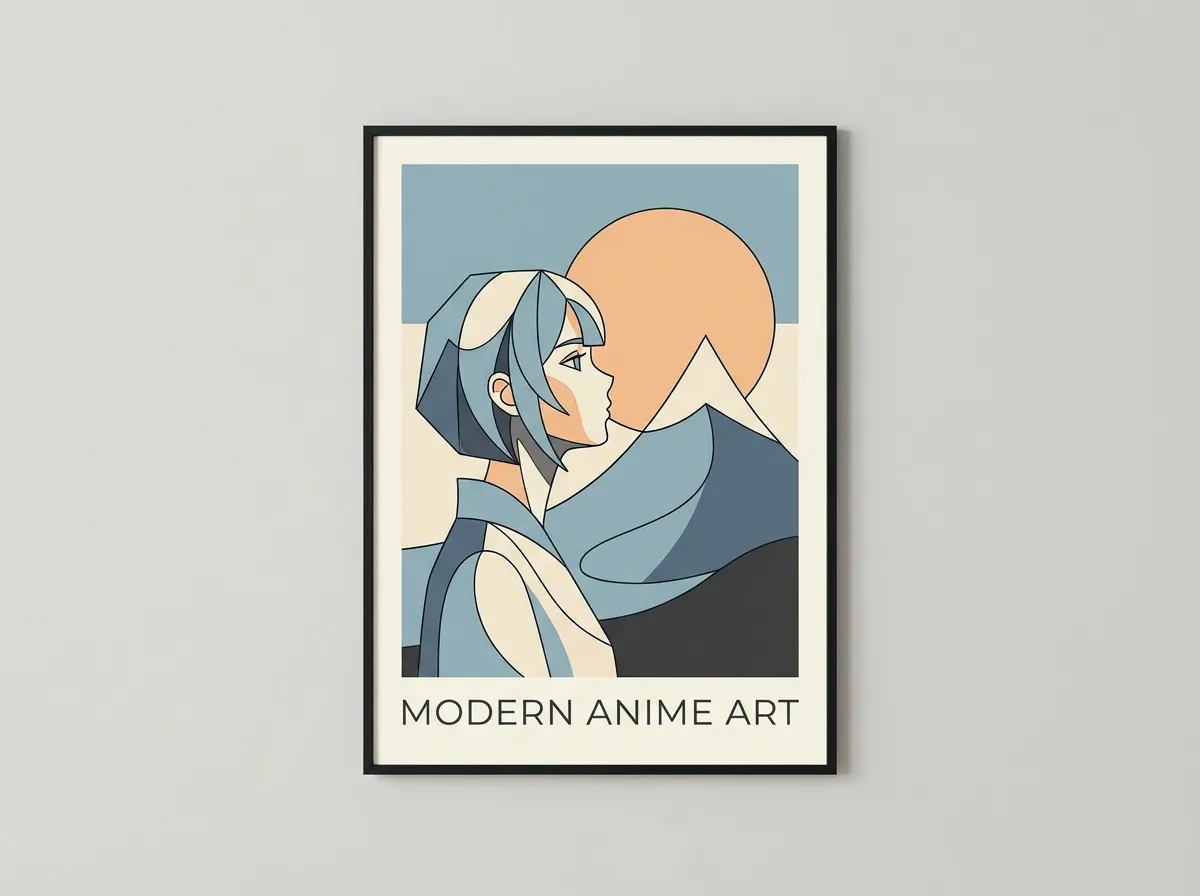
Minimalist anime style strips a character down to a single-line contour, two or three flat color blocks, and a single negative-space focal point. It is the look modern brand mascots, UI illustrations, and editorial spot art borrow when they want a face that reads at any size.
Minimalist anime is what is left when you stop drawing every detail and start asking which marks a face actually needs. The contour is usually a single confident line of even weight, the eyes are reduced to a slit or a dot, and the body is built from two or three flat color blocks instead of fully rendered planes. Color sits in a low-saturation palette of two to four hues, often anchored by a neutral with one warm or cool accent. Negative space is treated as a real shape, not as background to fill. The result reads as illustration in the same family as airport pictograms, modern Japanese editorial design, and contemporary brand mascots rather than as TV anime.
Designers reach for this look when a character has to survive a 32-pixel app icon, a metro poster, and a 4K splash screen with the same readability. It works for brand mascots, UI characters, app stickers, magazine spot illustrations, t-shirt graphics, and short-form social posts where the viewer scrolls past in under a second. On Anifusion you can describe the character in plain language, pick a minimalist prompt, and get a clean silhouette back, then iterate with prompts like "thicker single-line contour", "drop the second outline", "add one warm accent against the cool gray base", or "more breathing room around the head".
What separates true minimalism from low-detail anime is intent. Lowering the line count without rethinking the silhouette gives a flat, undercooked image. Real minimalist anime starts from a strong silhouette and a single focal block, then removes everything that does not pay rent. It is closer in spirit to a logo or pictogram than to a sketch, which is why this style sits well next to brand systems, app icons, and editorial design where consistency at every size matters more than rendering.
Try Minimalist anime style generation
Try the look on your own prompt. Start from one of the examples below.
Example prompts
"Minimalist anime style, minimalist anime girl, single-line black contour of even weight, two flat color blocks (cool gray skin, one mustard accent on the hair), generous white negative space, no gradients, no rendered shadows, icon-grade silhouette, modern editorial illustration"
Try this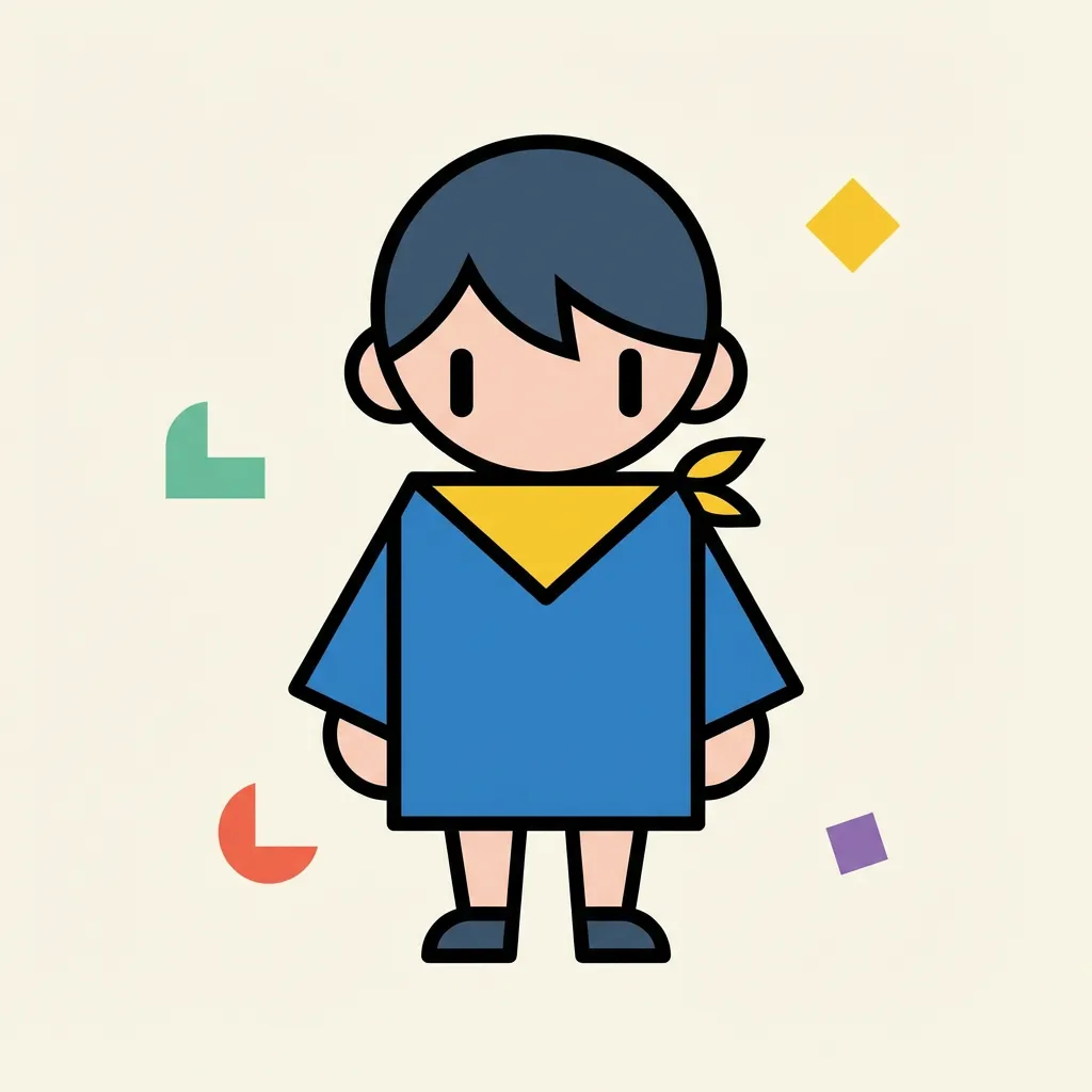
"Minimalist anime style, minimalist anime boy, thick black contour line, three-color flat palette of cream, navy, and one warm red accent, geometric hair shape, eyes reduced to two short dashes, large negative space around the head, no shading, brand mascot composition"
Try this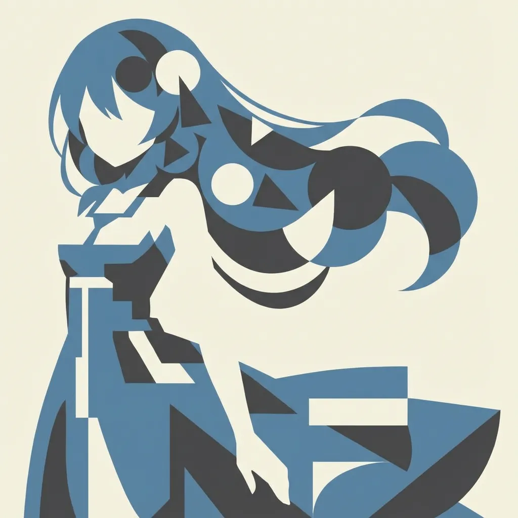
"Minimalist anime style, minimalist anime portrait, monochrome black plus one warm accent on the eye, single confident contour line, eyes as two small dots, hair as one solid silhouette block, full figure framed by negative space as a focal shape, designed to scale down to an app icon"
Try thisMake your own Minimalist anime style art
Type a prompt below, or tap a starter to begin.
Generate a Minimalist anime scene
Type a scene below and press Generate.
Why choose Anifusion?
Confident single-line contour
One outline of even weight wraps the whole character. The line is the silhouette, not a sketchy stack of marks, so the figure stays readable at icon sizes.
Geometric form simplification
Heads, hair, and props resolve to circles, ovals, and clean rectangles. The shapes do the heavy lifting, which is why a minimalist mascot still reads at 32 pixels.
Low-saturation flat palette
Hues stay restrained to two or three flat colors, anchored by a neutral with one warm or cool accent. The limited palette holds together across icons, posters, and wallpapers without retuning per surface.
Negative space focal block
Empty space is treated as a real shape that frames the head or carries the eye to one focal point. It is what makes a minimalist character feel composed instead of unfinished.
Flat color blocks
The character is built from flat color blocks instead of fully shaded planes. No gradients, no rendered skin tones, no airbrushed shadows, just confident flat shapes.
Icon-grade silhouette test
The pose holds in pure silhouette, with no stray hairs, no decorative props in front of the body, and no clutter in the negative space. Tested by squinting at the thumbnail.
Create in 3 easy steps
Write your prompt
Describe your vision for Minimalist anime style in plain language.
Refine settings
Tune the aspect ratio and style strength to your liking.
Generate and enjoy
Click generate and watch your masterpiece come to life in seconds.
Related styles
Discover more artistic directions you might love
Digital painting anime style
Digital painting anime style captures the look of an artist working in Procreate or Clip Studio Paint, with visible brush texture, layered color glazes, and a warm rim light that gives characters real volume. It suits pinups, splash art, and book covers.
Sketch anime style
The sketch anime style keeps the working drawing visible: pencil construction lines, ink hatching for shadow, and the soft graphite tooth of a real sketchbook page. It is the look used for character design sheets, storyboard panels, and life-drawing studies, before any clean lineart pass.
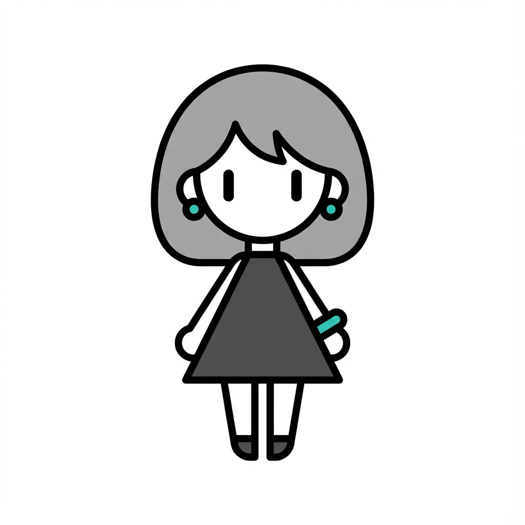
Chibi style
Chibi style takes a normal character and renders them with 2-head proportions, blob feet, oversized eye sparkle, and Q-version simplification. It suits stickers, emotes, shop mascots, line art keychains, and reaction icons.
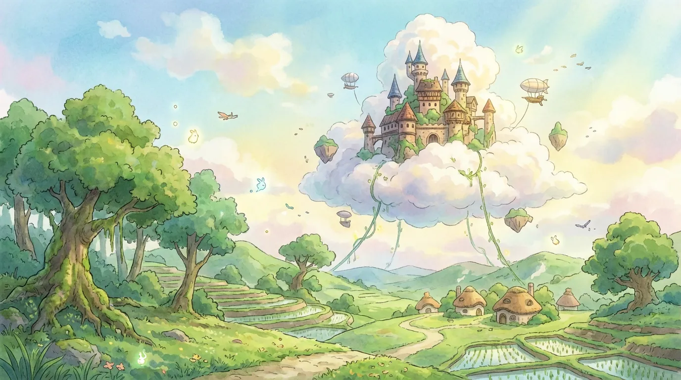
Frieren: Beyond Journey's End style
This aesthetic blends quiet emotional pacing, European-inspired fantasy architecture, and delicate linework with lush outdoor light. It suits journey stories, wizards, and long horizon landscapes.
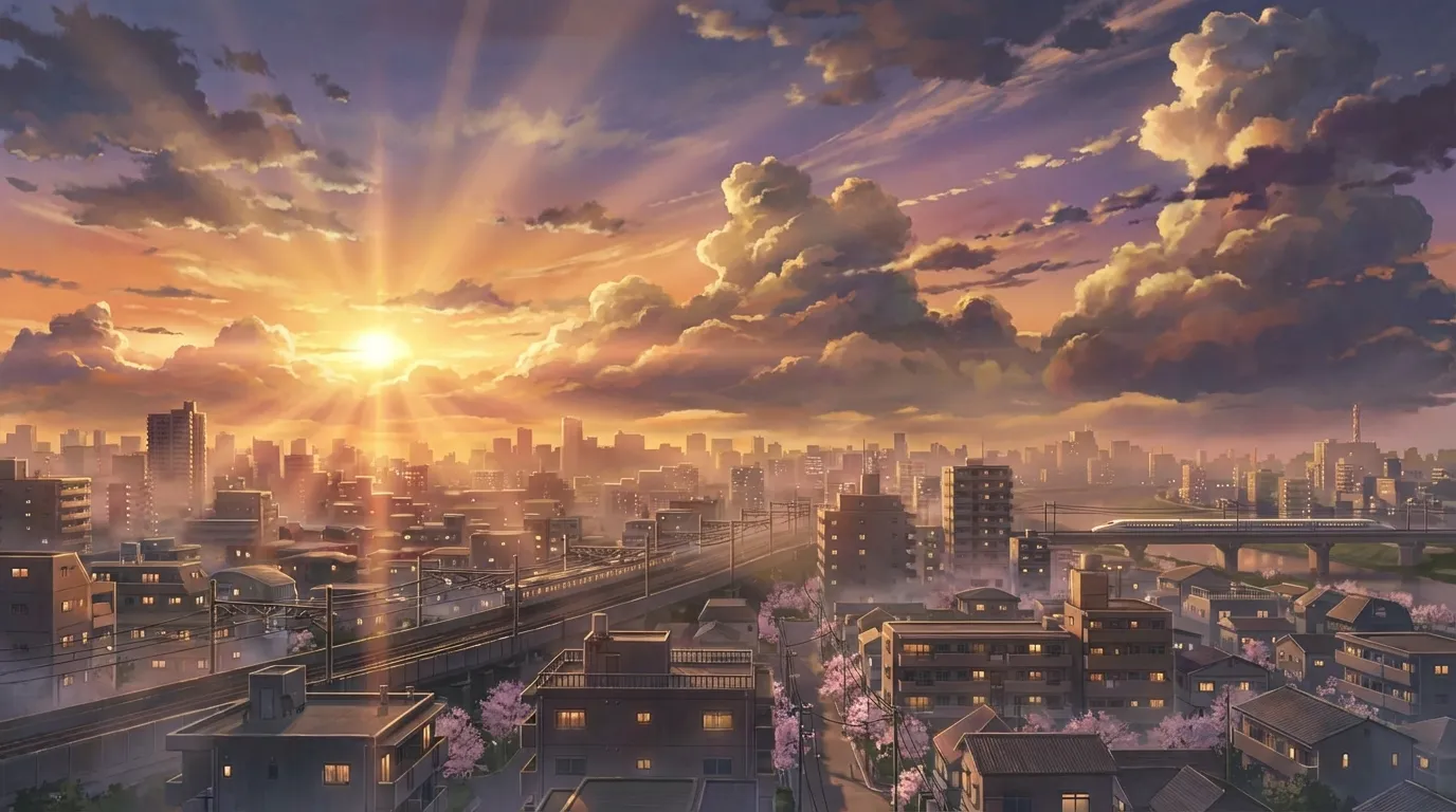
Makoto Shinkai style
Makoto Shinkai style pairs near-photographic urban Japanese backgrounds with stratus-cloud skies, golden hour lens flare, and quiet two-shot character framing. It suits emotional key visuals, train scenes, and rooftop sunset moments.
Studio Ghibli style
Studio Ghibli style pairs hand-painted watercolor backgrounds with gentle, expressive characters and a calm pastoral mood. It suits forest scenes, cozy interiors, sky vistas, and quiet character moments inspired by Miyazaki's filmography.
Frequently asked questions
Prompt tips, rights, and workflow. Sign up free to generate in this look today.
Generate a Minimalist anime scene
Type a scene below and press Generate.
What is minimalist anime style?
Minimalist anime keeps only the marks a face actually needs: a single-line contour, two or three flat color blocks, a low-saturation palette, and a clear chunk of negative space around the silhouette. It is closer to a pictogram or modern editorial illustration than to TV anime cel art, which is why it shows up in app icons, brand mascots, and poster work.
What does this style look like done badly?
Bad minimalist anime is just low-detail anime: the line count drops but the silhouette was never reworked, so the figure looks unfinished. Real minimalist work starts from a strong silhouette and a clear focal block, then removes everything that does not pay rent. If you can read the character with the body squinted into a flat shape, the design is doing its job.
What palette works best?
Two to four hues, low saturation, anchored by a neutral with one warm or cool accent. A common starting point is "cool gray base, one mustard accent" or "cream and navy with a single warm red". Wide rainbow palettes pull the look back toward a normal flat-color anime illustration rather than a minimalist one, so it pays to stay restrained.
Where does minimalist anime work best in the wild?
App icons, brand mascots, sticker packs, magazine spot illustrations, t-shirt graphics, social posts that need to read in under a second, and UI characters such as onboarding illustrations and empty-state graphics. The same character can sit on a 32-pixel tab bar and on a wall-sized print without re-drawing the file.
How is minimalist anime different from chibi?
Both reduce the figure, but they reduce in different directions. Chibi keeps anime detail (full eyes, soft cel shading, animation lineweight) and shrinks the body proportions. Minimalist keeps adult proportions but strips out the rendering itself, replacing shaded planes with flat color blocks and absorbing detail into the silhouette. They are sister styles, not the same one.
What prompts push the model toward a minimalist look?
Be explicit about reduction. Phrases like "single-line contour", "two-color flat fill", "no gradients", "no rendered shadows", "low-saturation palette", "icon-grade silhouette", and "negative space as a focal block" all push the model away from a default rendered anime look. Specifying the palette concretely ("cool gray base plus one mustard accent") tightens the result a lot.
Start creating Minimalist anime style art today
Join 130,000+ creators and bring your imagination to life with 100 free credits.